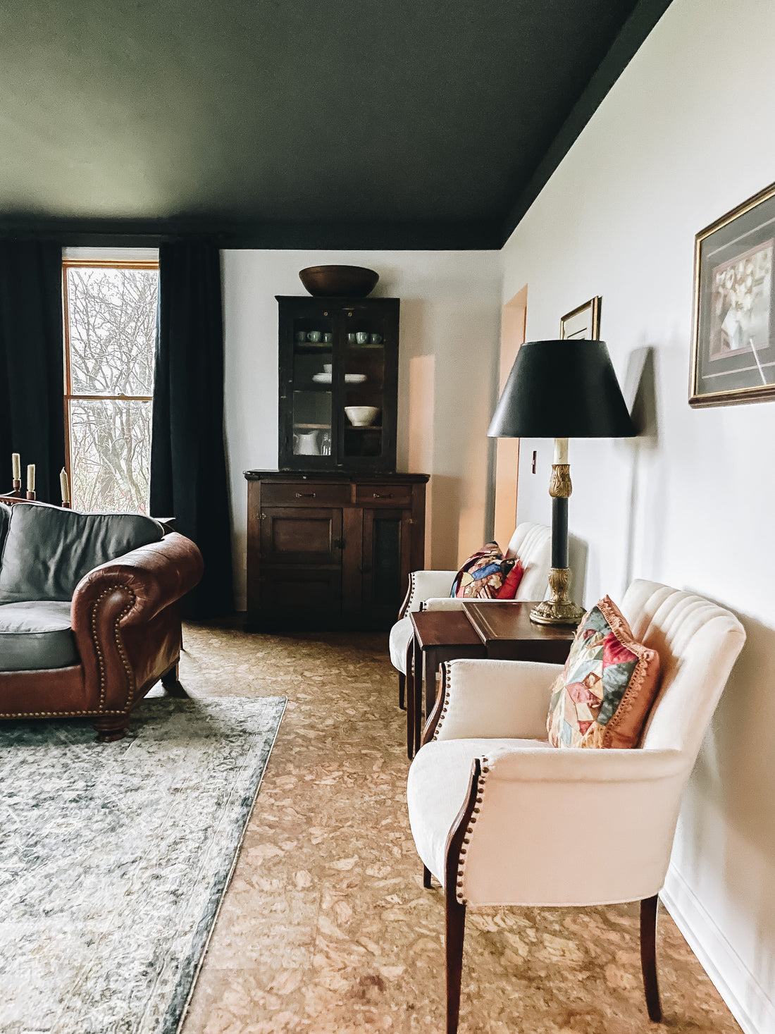
Never underestimate the power of paint and a new furniture layout. This room feels like a really big change but it was really minimal work. The room had a lot of furniture and dated wall paint making it feel cramped and dark.

We picked fresh neutral paint for the walls and trim and a dark color for the ceiling to create the wow factor. This instantly creates a bigger space thats well grounded.

- before -
When determining a layout for your furniture consider the flow of traffic and how one would move throughout the space. Ask yourself are there any road blocks? Can you walk with good flow without going around furniture?
To create a good flow of traffic we removed two larger pieces of furniture from the room. We added in smaller pieces with the same function and it created a much bigger feeling space.
For the ceiling we chose a cool charcoal black with a powerful calming effect, we carried it down the walls 7" to create higher ceiling illusion and some character to fit the homeowners style.

Fresh paint, accent lighting and a rug complete the space. The homeowner had amazing furniture pieces already we kept and reused them all.
When thinking of design, not all rooms need walls removed and new flooring. Sometimes it just takes a new layout and a little imagination.


Paint Colors
all from Sherwin Williams
The Budget
- Paint - $255 from Sherwin Williams (Three cans, one for each color)
- Curtains - $340 from Amazon (five panels)
- Rug - $299 from Homegoods
- Accent Window Sconces - $49.99 from Amazon

